Finderly
- Role
- Design Engineer
- Timeframe
- June to July 2026
- Outcome
- Product-wide UX overhaul shipped in one month: 303 files, a real design system, a media-first product
- Stack
- React Native, Expo, TypeScript, Material 3, Reanimated, Claude Code, Codex, Figma
Finderly, by AI Vision Technologies, is an AI repair expert: capture the broken thing, get a diagnosis, fix it yourself or hand it to a pro. It runs on React Native and web. Over one month I designed and shipped a product-wide UX overhaul, 379 commits across 303 files, from the color system to the camera to the server’s feedback endpoints. Underneath all of it sat one decision.
The default shape
In 2026, every AI product ships the same first screen: a text box that says “ask me anything.” Finderly had drifted toward that shape too. But Finderly’s problems are physical. A leaking valve. A dead outlet. A noise the dryer should not be making. The fastest way to describe a physical problem is not typing, it is pointing a camera at it, and the product’s first screen was treating its best input like an afterthought.
The decision
Rebuild Finderly as media-first and state-aware, not chat-first. The new home leads with a persistent “Start a fix” capture hero, your recent projects, and a grid of common fixes. Phones got a real floating navigation dock plus a dedicated camera button, replacing a bottom bar where some tabs were navigation and some were decoration. Account stopped pretending to be a destination and moved behind the avatar, where it belongs.
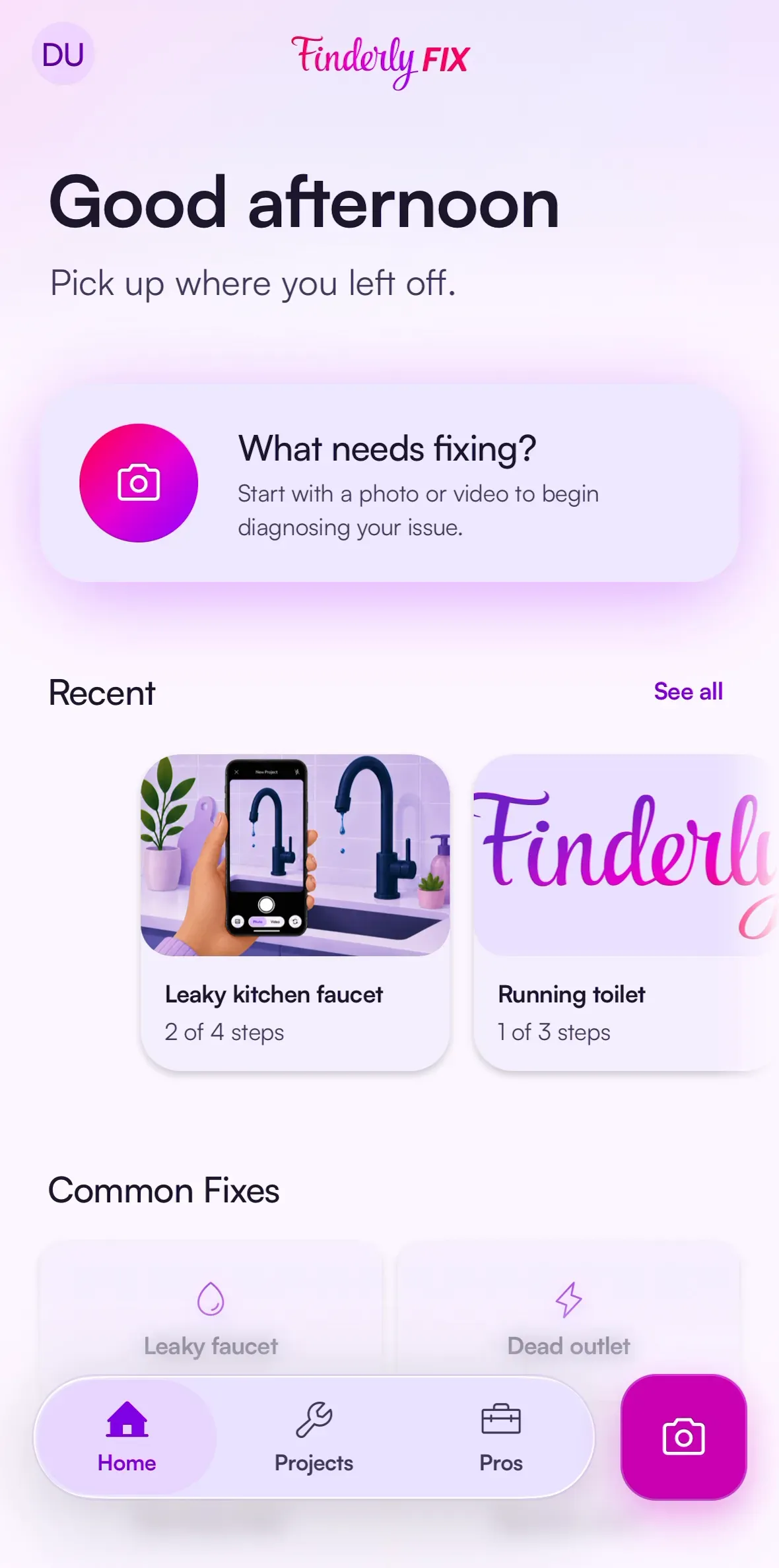
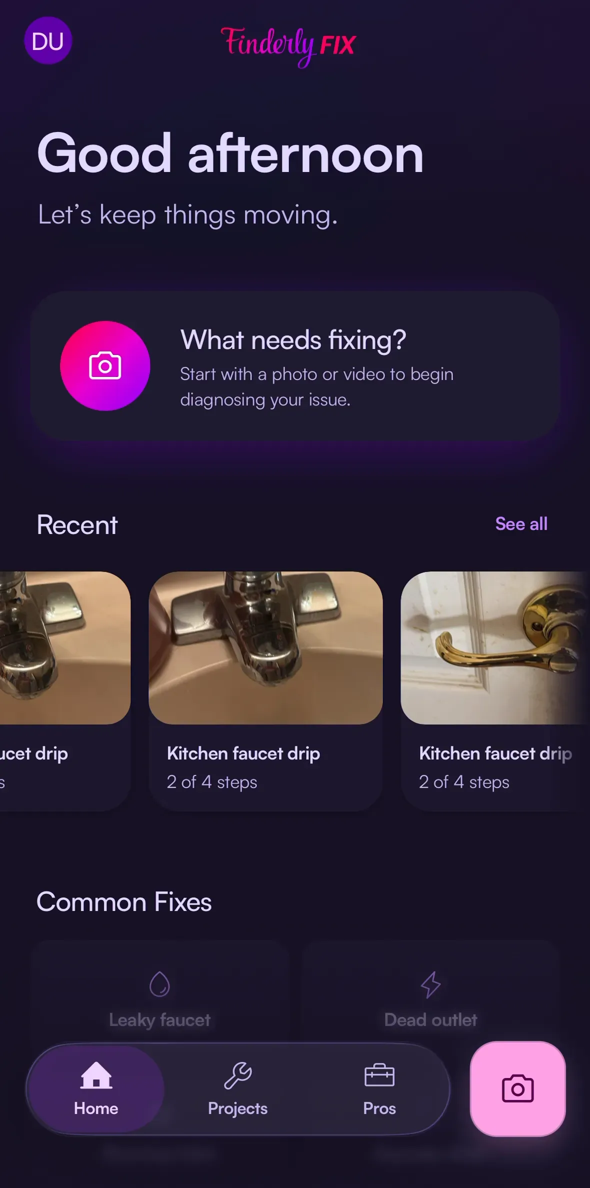
The same standard, the interface should not lie, drove decisions well past the home
screen. Project cards hide their progress bars entirely, because the backend’s step
tracking was not yet trustworthy and a made-up percentage is worse than none. The native
app dropped its misleading cookie banner for real privacy controls. The web app records
AI consent as passive instead of falsely claiming the user explicitly agreed.
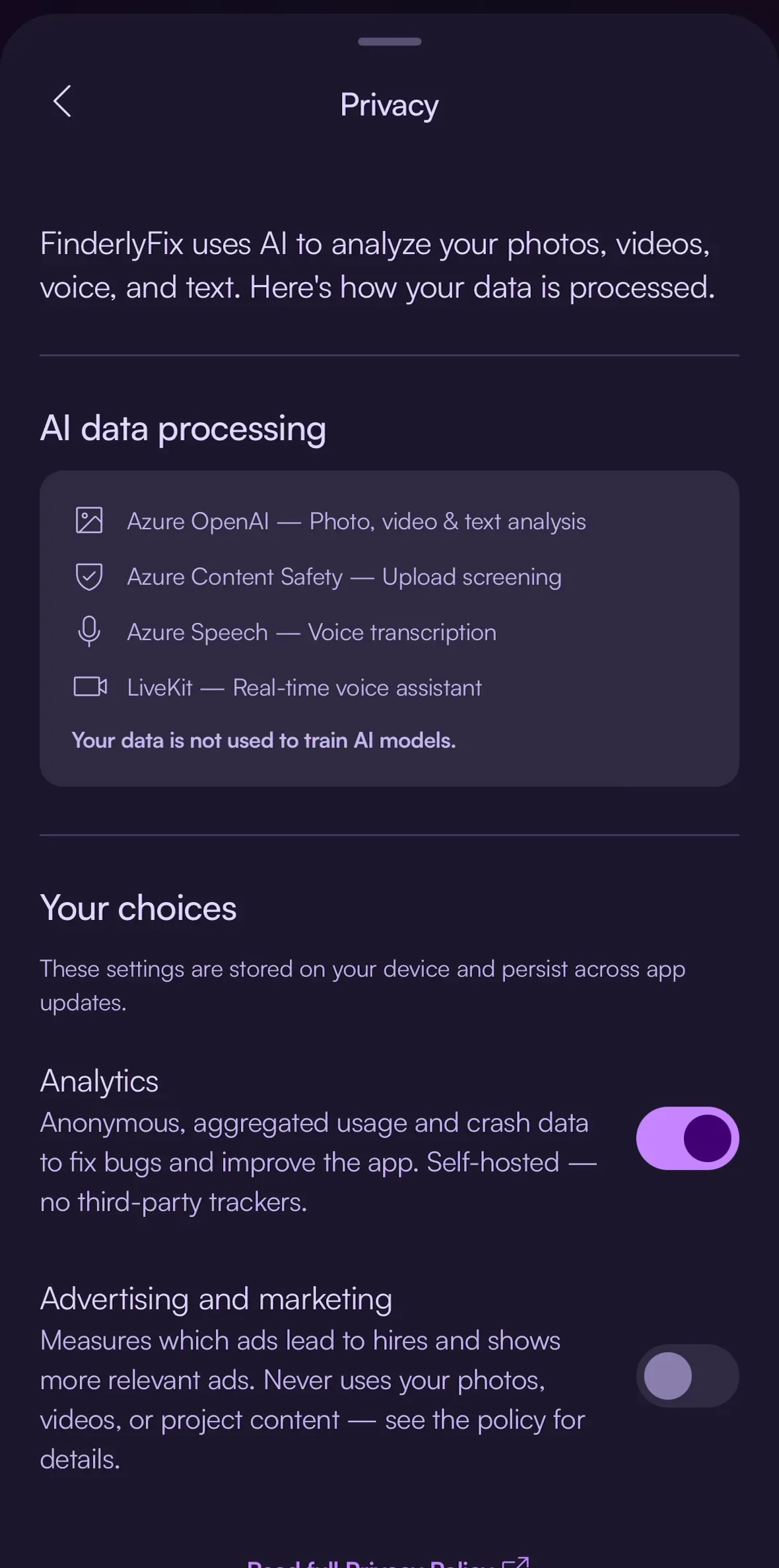
Making capture worth leading with
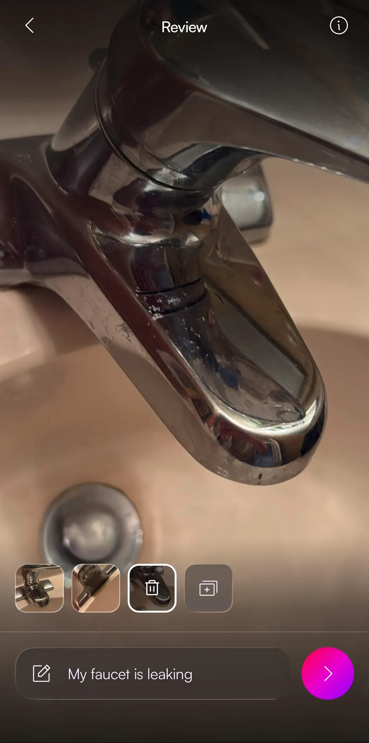
A capture-first product needs capture that feels effortless, so the pipeline got rebuilt end to end. The camera now does ordered multi-capture, up to six photos or one video, stays warm between shots instead of relaunching, and never silently discards media. Review became one focused surface: swipe through what you shot, drop a note, hit Analyze.
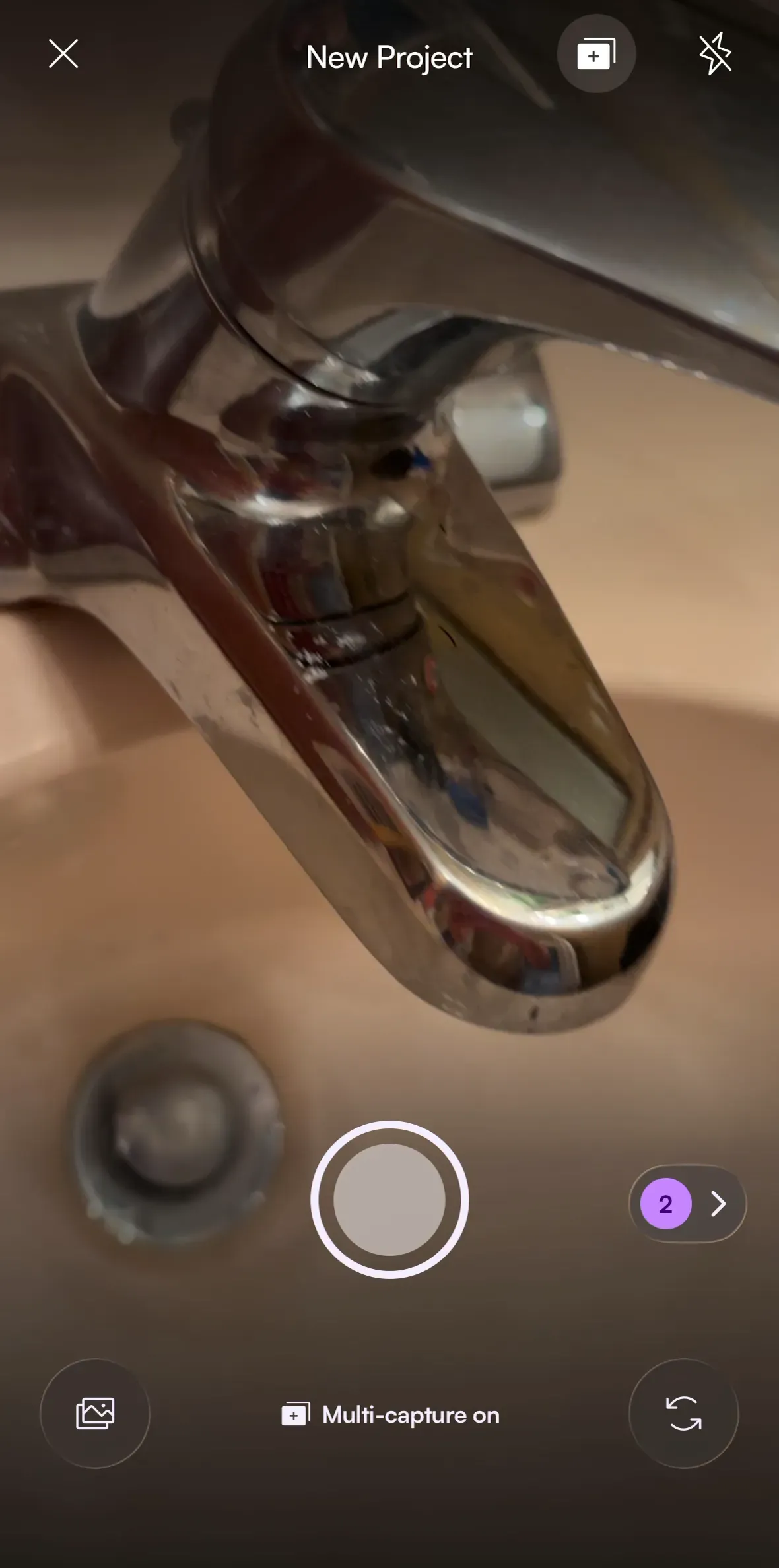
Then the wait. Instead of chat bubbles faking incremental progress, analysis renders a living blueprint: a theme-aware house sketch swept by a scanning gradient, driven by the real upload and analysis lifecycle. Progress only moves forward, respects reduced-motion, and cancelling returns your media and note intact.
What got cut
The seniority work was subtraction. I built drag-to-reorder for review media, then removed it: swipe plus thumbnails did the job without the gesture complexity. Sound recording came out of the review screen entirely, because sound is a contextual diagnostic the AI should ask for, not a universal way to start a project. Both cuts made the shipped product simpler than the one I first designed.
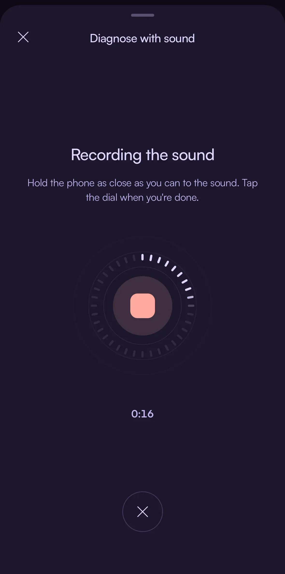
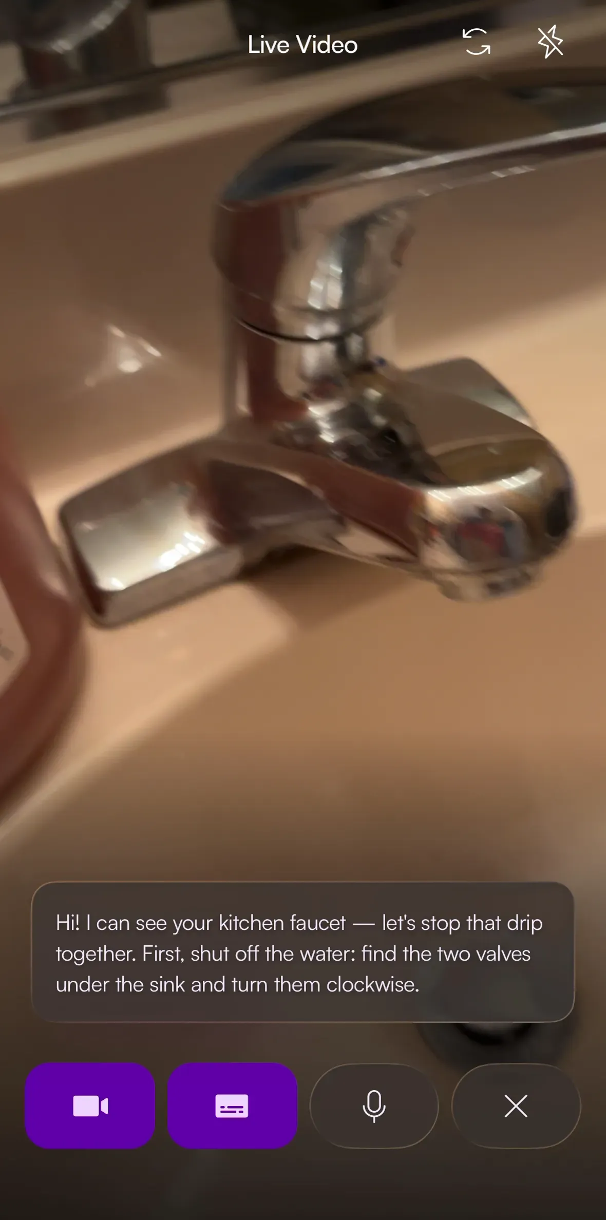
Where sound went: an AI-requested diagnostic with its own instrument. And live video, where the assistant answers with real instructions.
How one designer ships this in a month
The overhaul ran as an agentic workflow. A design audit document became the operating system: live handoff notes, prioritized workqueues, animation specs, and a hook that points every AI agent at the same source of truth. Deterministic demo data and offline API mocks made every signed-in state reproducible without a backend. AI agents built at my direction; the taste, the cuts, and the QA stayed human. The month ended with the frontend suite green and the branch merged to main.
The full system inventory, platform hardening, and safety redesign live in the deep dive.
Deep dive: the system underneath
Color and type. The hand-tuned palette became a Material HCT-generated system: 57 semantic roles, purple primary through a new pink-red quaternary, lavender neutrals, standardized dark-mode surface ramps and elevation. Poppins came out; Satoshi became canonical. The token maps record their own judgment calls inline: light-mode accents ride tone 48 because tone 50 fails AA by a few hundredths and tone 40 read too dark, and dark-mode primary rides tone 70 because tone 80 read too pastel for the brand. Generated breadth, human overrides, both in version control.
Brand slots in, roles out. Nothing between them is hand-maintained except the judgment.
Components. New primitives (glass surfaces with iOS 26 Liquid Glass and BlurView fallbacks, callouts, chips, FABs, touch slots) plus every existing control realigned to Material roles and interaction states. A design-system gallery screen keeps them honest.
Platform hardening. Bottom sheets gained interruptible gestures, detents, and keyboard-aware expansion. Back navigation became instant, with async cache writes and a timestamp guard against stale-state races. A long tail of Android-specific fixes: first-open flashes, disappearing blur, keyboard avoidance.
Safety, honestly tiered. The safety banner was rebuilt so only true emergencies use the red error tone, contractor warnings read as information, and every tap-to-dial action was removed while emergency copy guarantees an explicit “call 911” instruction. Mutation-style tests make the safeguards regression-proof.
The unglamorous rest. A full email-auth overhaul, linked sign-in management with a server guard against removing your only login method, message feedback endpoints with one-vote semantics and rate limiting, and consent flows that match what actually happens.
What deliberately did not ship: a swipe-scrubbed onboarding experiment stayed gated off, read-aloud and regenerate were deferred, and user-facing step status waits until the backend can be trusted to report it.